Advertising Makeover: Evolution
This is my first entry in the Advertising Makeover series I will be putting together.
While doing my normal daily routine I came across this post by J.D. over at Evolution. It seems J.D. has attempted to run advertising in the past and not had much success. After reading the post and looking over his design I immediately noticed that the advertising was tucked away out of view as if J.D. was embarrassed to even be adding it.
I commented on this and J.D.'s response was:
Okay, a couple of questions:- If you had my layout the way it is right now, where would you put the ads?
- Is it worth considering a three-column layout?
Is it worth considering a three-column layout?
Let me address the second question first. You don't need to abandon a two-column layout if that is what you prefer. J.D. has a lack of stuff on his navbar, which keeps things nice and clean. Adding a third column wouldn't really make sense unless you really have a lot of stuff to add to your website. So the answer to the second question is no.
If you had my layout the way it is right now, where would you put the ads?
I will address this question in detail.
Below is a screenshot of Evolution at the time of this writing.
A cursory glance at the Google Heatmap on advertising shows that particular area as yellow or even white if it is low enough on the page. The CTR's (Click Thru Rate) in these areas will be low to poor.
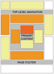
So the first thing we would have to do is move the ads into an area that is more highly valued. This would entail moving the ad to the left. Since we would be keeping a two-column layout that means the whole column needs to be moved there. Additionally J.D. is using the smaller tower width of 120. The wider 160 tower performs better than the 120 and therefore we would increase the size to the larger tower of 160x600.
Glancing at the Heatmap and from past experience I would also recommend an ad unit near the top of the page as well and an additional ad below the content. I would put this ad between the content and comments. A 336x280 works very well below the content from my testing. For the top you could either go with traditional 468x60 banner size or the much better performing 728x90 Leaderboard.
Where To Put The Advertising: First Suggestion
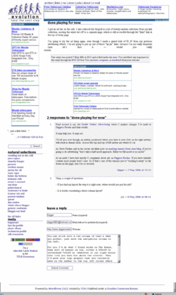
This is with a 728 Leaderboard ad unit. In it's current state it looks a little out of place, but if you increase the content area size a bit and work with the design it wouldn't look bad at all. In addition you can see the ad unit below the content. The logo has been moved to the top left and included in a header portion that includes the navigation links and the Leaderboard ad unit. Below this header area I have moved the navbar from the right to the left and put the 160x600 tower unit at the top of this and moving the quotes, search and other navigation items below this ad.
I would not segment the ad in it's own area by placing some sort of title on the advertising portion like the current version has of "admire me, admire my ads".
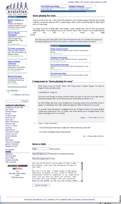
Where To Put The Advertising: Second Suggestion
What Colors Should I Use?
Colors are a key to increasing CTR and also to making your design look much cleaner with advertising on it. The current colors being used of pink make it stand out too much and not fit in as nice with the design. For the ads I would immediately drop the border altogether by changing the color of the border to white.
I would change the link colors in the ad unit to the same colors of the links in the navigation of a darker purple color. Blue is always best I and others have found, but in this case making them a dark purple could work well since they flow with the overall colors in the website design.
For the text of the ad I would leave it black since that is the color of the content area text. For the URL link in the ad I would make it as light a gray as possible. I think with a white background the most you can get away with is #999999 from Google.
Tracking Results
As with any advertising you put on your site from Google you should track it with available methods they provide, namely Channels. I would create three channels: evo_top_728x90, evo_left_160x600 and evo_mid_336x280. I would also create a URL channel of his domain: http://www.evolution-nextstep.com/. This channel would track all impressions and clicks for the whole of the website while the individual channels would only show impressions and clicks for those specific ads.
When you create the ad unit's select the appropriate channel. This way you can judge the performance of an ad. If it is underperforming or not worth it you can make appropriate changes -- or cut it altogether -- and then judge the results of these changes. Without channels you are flying blind as to which ad units are performing.
Result Of Changes
Of course the number one thing to do with online advertising is test, test, test. I'm not sure if the recommendations that I've made for the website above are the best they could possibly be, but if J.D. does implement them I would love to hear the results that are accomplished with the changes.
This entry is in the following archive(s):
Advertising Makeover Archive
Posted on Tue May 09, 2006 at 12:24 AM | Permalink | Email This | Blogroll IOA! |
This article is good stuff, I've been reading quite a bit online in the last few weeks about making money from website content and am just getting my site online but your information about the Heatmap was good. We'll see what happens in the next year.
Thanks for the information
Joe
Technical information for the non-guru
Subscribe Without Commenting
Receive comments others make on this topic without having to comment above.