A 468 Banner Vs. A 728 Leaderboard And How To Make Major Header Design Changes
I have been looking at revamping the Diggers Realm header for awhile now. It's initial design was several years ago and was built around a 468x60 banner ad. Since then the website has grown and additional banner sizes have appeared in most online advertising systems like Google AdSense. Included is the big, ugly 728x90 leaderboard ad unit.
How can you implement such a large change into the overall website though without dropping everything down more on the page and below the fold? This was a great concern for me. Also of concern was trying to keep the 728 leaderboard meshed into the site so it didn't stand out too much. So after playing around in Photoshop and cutting and pasting and moving things around with a screenshot of the website I settled on the changes and have implemented them.
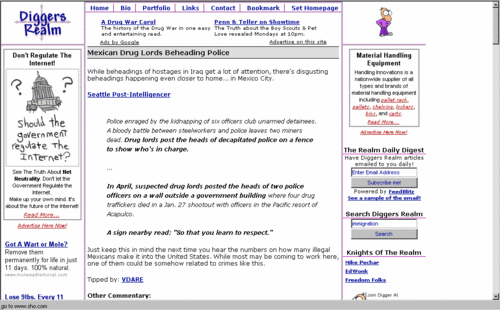
Below is a screenshot before the changes.
The first thing I did was create a new logo and save the images. I then downloaded the template that I use for just the header of the website. I still use tables and here's one trick that you may use that might have a direct impact on your CTR. If you put your header portion of your page -- with the ad in it -- in it's own self contained table it will load and display immediately while the rest of the page downloads. The rest of the page can go in it's own table that's the same width. That way if someone gets sick of waiting for the page to load they have the option to click one of your ads!
So, I worked up the HTML for the header (I use straight notepad) and viewed it alone in the browser with a placeholder 728x90 graphic for the ad unit.
Once that worked I went to a page on the site and right clicked and saved the source. I then copy and pasted the new header HTML over the header HTML in the saved file and loaded that in a browser.
I made sure things were lined up between the new header and the content and navbar areas, then I focused on the advertisement.
I created a new channel in Google AdSense to track the new header ad unit. I got the code for the 728x90 ad unit and pasted it into the header.
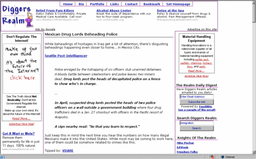
I then threw the code up on the webserver. Below is a screenshot after the changes.
One main thing I paid attention to when reworking the header was white space. In the before screenshot you can see quite a bit of white space on the right. While I wanted things a little more compact, I didn't want to make it too cluttered.
Another consideration was the "Ads by Google" and the "Advertise on this site" links that Google places. I usually try to keep these butted up again some portion of the design so that they don't stick out so prominently.
Unfortunately I'm not too happy with the way the left link for "Ads by Google" sticks out past the left navbar purple border. In a perfect world That would line up with the border and not stick out. I haven't had much luck with the "Advertise on this site" link through Google, so I've turned it off for now in hopes that the "Ads by Google" link moves to the right side of the ad unit.
I'll now leave this up for awhile and judge the performance. I'll of course report back on my findings, so if you wish to keep updated subscribe to my RSS feed or the email daily digest you can find on the navbar. That way you won't forget to see the results of my changes.
As with any drastic change like this, always save a backup of the code that works! If your results are really horrible you can just replace the code that was showing results quickly and test something else later.
This entry is in the following archive(s):
Analysis Of Changes Archive
Posted on Fri May 19, 2006 at 05:21 AM | Permalink | Email This | Blogroll IOA! |
Subscribe Without Commenting
Receive comments others make on this topic without having to comment above.