Your Website Designs Impact On Ad Placement And Performance
What impact does your website design have on your advertising performance? It has a whole lot to do with it and I'll show you why.
First off let's tackle the actual size of your website. Size has a double meaning here. The first thing is the actual size of your page in Kilobytes. If your page is massive and takes a long time to download on a dial-up connection then you are missing a lot of potential end users.
Page Load Times
Why dial-up, isn't this the day and age of high speed internet connections? No it's not, yet. The majority of users are still on a dial up connection and you want your site to encompass as large of a potential base of customers as possible. If you are running AdSense, YPN! or another form of pay per click adverting and your site takes forever to load the user may not stay around to wait for it. There are many ways to reduce the page size of your website and I'm not going to go into them here, but it's safe to say that large images or lots of images on your page are a major contributor to page load times.
Physical Dimensions
The second form of page size is the physical dimensions of your website. What screen resolution is your design optimized for? Are you using a one, two or three column design? The current common screen resolutions you really need to take into consideration are 800x600 and 1024x768. Resolutions larger than that can probably be ignored unless you have a really poor design that expands to the width of the users screen. In that case you need design help not advertising help. I'd suggest sticking to a fixed width website because you have more control over it's look and feel for advertising rather than a variable width design..
Screen Resolutions
OK, so how does screen resolution come into play with advertising? Below are three images of Diggers Realm at different screen resolutions. From top to bottom we have 1280x1024, 1024x768 and 800x600.
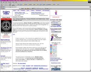
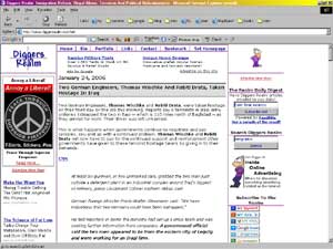

Do you see how the right navigation bar gets cut down more and more? Also "above the fold" -- or the portion of the page that the user sees without scrolling -- gets shorter and shorter. This should be a hint to you on where you should place your ads. If you want every user to see your ads and have a chance to click on them then they should be at the top of your page and on the left side since those areas will always be visible to every user.
Now This is a three column design. If you are using a two column design you will probably be able to fit the whole page width on the 800x600 resolution with no horizontal scrolling needed. With a three column design however, anything you put in the right column will be cropped unless you have a very tiny content area in the middle and small navigation bars on each side.
Remember this when you are looking at your page. Also of note is the shortening of the above the fold portion of the page. If your logo area is too tall and pushes your ads down further -- depending on your design -- it could push the ads below the fold area on an 800x600 design.
How important is considering 800x600 resolution users?
"What's the point, nobody uses 800x600 resolution anymore. I haven't used it in about 5 or 6 years!" you say. Well the fact of the matter is that a lot of end users aren't on the computer as much as you may think. Being a webmaster you spend a lot more time on the computer than a regular person and they may not have upgraded for a very long time. Here are what my stats look like for screen resolutions:
| 1024x768 | 55.13% |
| 800x600 | 21.23% |
| 1280x1024 | 14.42% |
| Other | 3.89% |
| 1152x864 | 3.70% |
| 1600x1200 | 1.23% |
| 640x480 | 0.36% |
Your stats may differ from mine, but probably not by a ton. So 21% come to my website in 800x600 and see the third image presented above with the right column cropped. When I used to run my AdSense ads in the right column it's no wonder that the Click Through Rate wasn't impressive, they couldn't even see what half of it said! There's not a good chance of someone clicking on something they can't even read.
I would shrink the site down to fit in 800x600, but I just can't do that and still have an enjoyable sized middle column, which is the most important part of the site. I won't sacrifice the usefulness of the content and the website simply to be able to fit both columns into smaller resolutions and you shouldn't either.
What does 21% mean to you?
21% is 210,000 visitors out of a million, so if you are taking your advertising serious on your website and actually want to produce revenue, take a look at your website in smaller resolutions and take that into account when doing ad placement on your website.
I've been meaning to post on this topic for a couple months and some others have hit upon the topic. There's more on the static vs. variable width design over at Problogger and Grey Wolf
This entry is in the following archive(s):
Advertising Archive
Posted on Tue Jan 24, 2006 at 11:31 AM | Permalink | Email This | Blogroll IOA! |
Subscribe Without Commenting
Receive comments others make on this topic without having to comment above.