Ad Placement: Left Navigation Vs. Below Content
I received a premium BlogAd this week that has filled my whole "above the fold" space on the left navigation bar. The Google AdSense on that page has been pushed down.
Below is an earlier screenshot of Diggers Realm with a slightly smaller BlogAd that allows for the AdSense to peek above the fold and get some exposure.
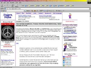
However, with the new BlogAd there is nothing of AdSense seen above the fold. This of course affects the Click-Through Rate (CTR) and revenue from that ad spot. As I mentioned in my article / tool "The BlogAds Calculator, this should be taken into account when pricing your BlogAds. This loss of revenue from the AdSense spot being pushed down is already built into the price of the BlogAd, so I'm not depressed at these occurrences. I receive a guaranteed income from the ad in that spot that at least exceeds what I would normally receive there from AdSense.
I took this opportunity to run an experiment and not lose any revenue in the process.
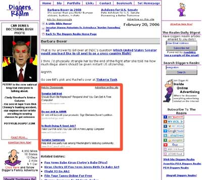
First, I totally removed the left navbar AdSense spot and decided to place a 336x280 spot below the content of my entries and above the Related Entries internal links for the entry. I set up a new channel in AdSense so I could track this spot. With past performance of the left navbar channel and a weeks worth of data on ads below the content I could actually have a free opportunity to judge the difference in effectiveness in both total revenue, CTR and eCPM (Earnings per thousand showings) of the channels.
Below is a screenshot of where the new ad is on a smaller entry.
I have about a day and a half of data so far, but not enough to make a conclusion. I will say that the results are at least comparable so far. I'll post more after there is more data coming in and I can make some determination as to the true differences in performance.
This entry is in the following archive(s):
Analysis Of Changes Archive
Posted on Tue Feb 21, 2006 at 08:27 PM | Permalink | Email This | Blogroll IOA! |
Interesting. The only problem with that adstrip is that, unlike stuff in the sidebars, it really interferes visually with site content. Any reader complaints?
Yes, I realize that as well. I haven't had any complaints yet, but I may. I'm going to keep an eye on it for a week and see how things turn out. If it performs well I'll take a look at somehow integrating it into the design without being so "annoying".
I'm always testing.
What annoys me are the people who put a big block ad like that above even the headline of their post and you have to scroll down to start reading. At the same time if the content is worth it I just realize that is the only way they are monetizing their site and am not too annoyed.
Dealing with scrolling down for good reading is much less annoying than ponying up $5 bucks a month in membership dues or some other form such as *gasp* popup ads.
Subscribe Without Commenting
Receive comments others make on this topic without having to comment above.